The theme of this issue Kismet revolves around the fateful convergence of circumstances and questions of how destiny plays a role in our lives. My position as Art Director allowed me to help the designers across concepts as well as structure the underlying framework for the entire issue. 
Margins, Grids, and Typography
After a discussion with the Editor-in-Chief, we identified that previous magazine issues had problems with cohesion. Designers were given great latitude to decide their own margins, typefaces, type size/leading/tracking/etc. While this encouraged creative freedom, it often resulted in abruptly different visual styles between and within concepts. 
To resolve this, new systems were introduced. Printed at 8.5" x 11" with a 0p9 bleed, margins were set using ratios in the Fibonacci sequence (2p, 3p, 5p, and 8p for the inside, top, outside, and bottom margins, respectively), and a 12 x 8 grid was constructed with a 1p0 gutter. Together these dimensions allowed graphic designers sufficient space to make unique design decisions for their concepts while still maintaining a sense of unity throughout the magazine.
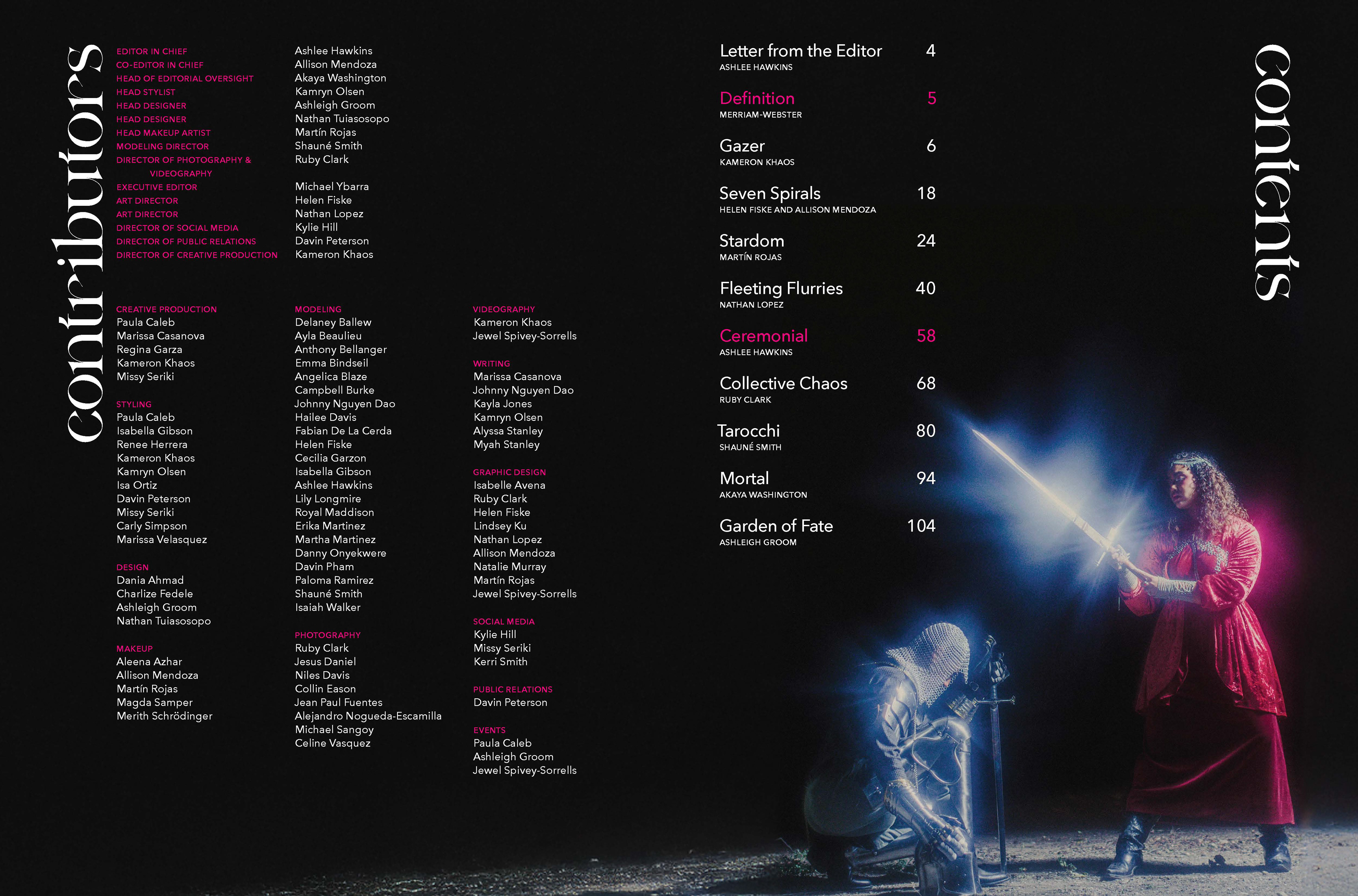
Kismet: Department Credits and TOC
Kismet: Ceremonial
Kismet: Ceremonial
The type was also streamlined through the use of a 12pt baseline grid and the selection of a single body font: 9.5/12 Avenir Next Medium. This geometric sans serif typeface provided a sleek and versatile base for any concepts or type. It is also a callback to Lewk Magazine Issue 1, which used Avenir as its display typeface. As the magazine transitioned to new management for the current issue, the Editor-in-Chief wanted to build a new legacy for the magazine while still respecting our origins. The return to Avenir reminds us of where we started, but by using the reworked version and as the body typeface, it also symbolizes this new chapter in our history. 
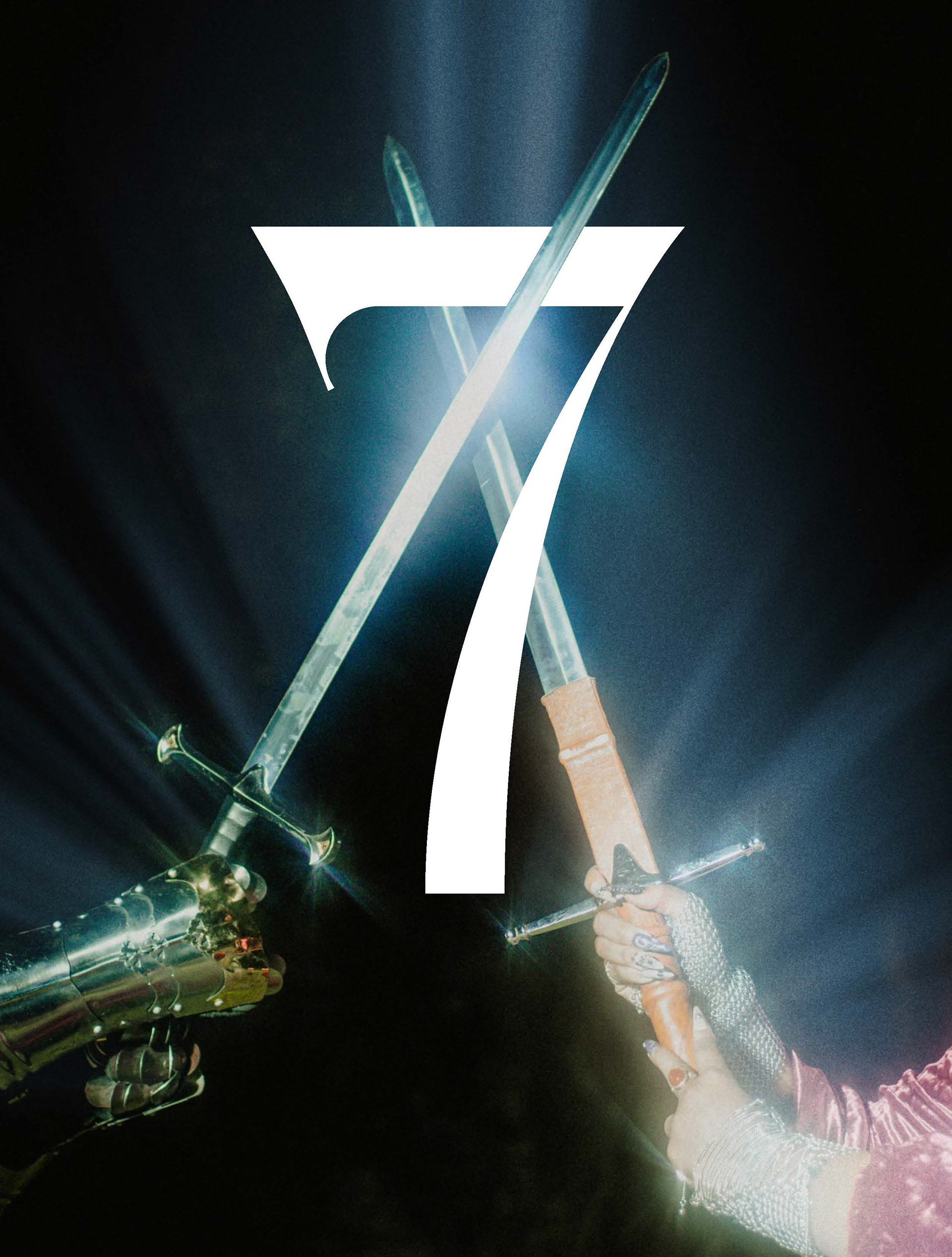
The typeface Kelyon was used for display type. It was selected for its high contrast, angled stress, and curved crossbar on the "e." This ethereal design aligns with the Arthurian themed cover shoot as well as the superstitious undertone of the issue's theme. Kelyon was used for titles and headings in the end matter, the concept title for "Ceremony," and page numbers throughout the magazine. 
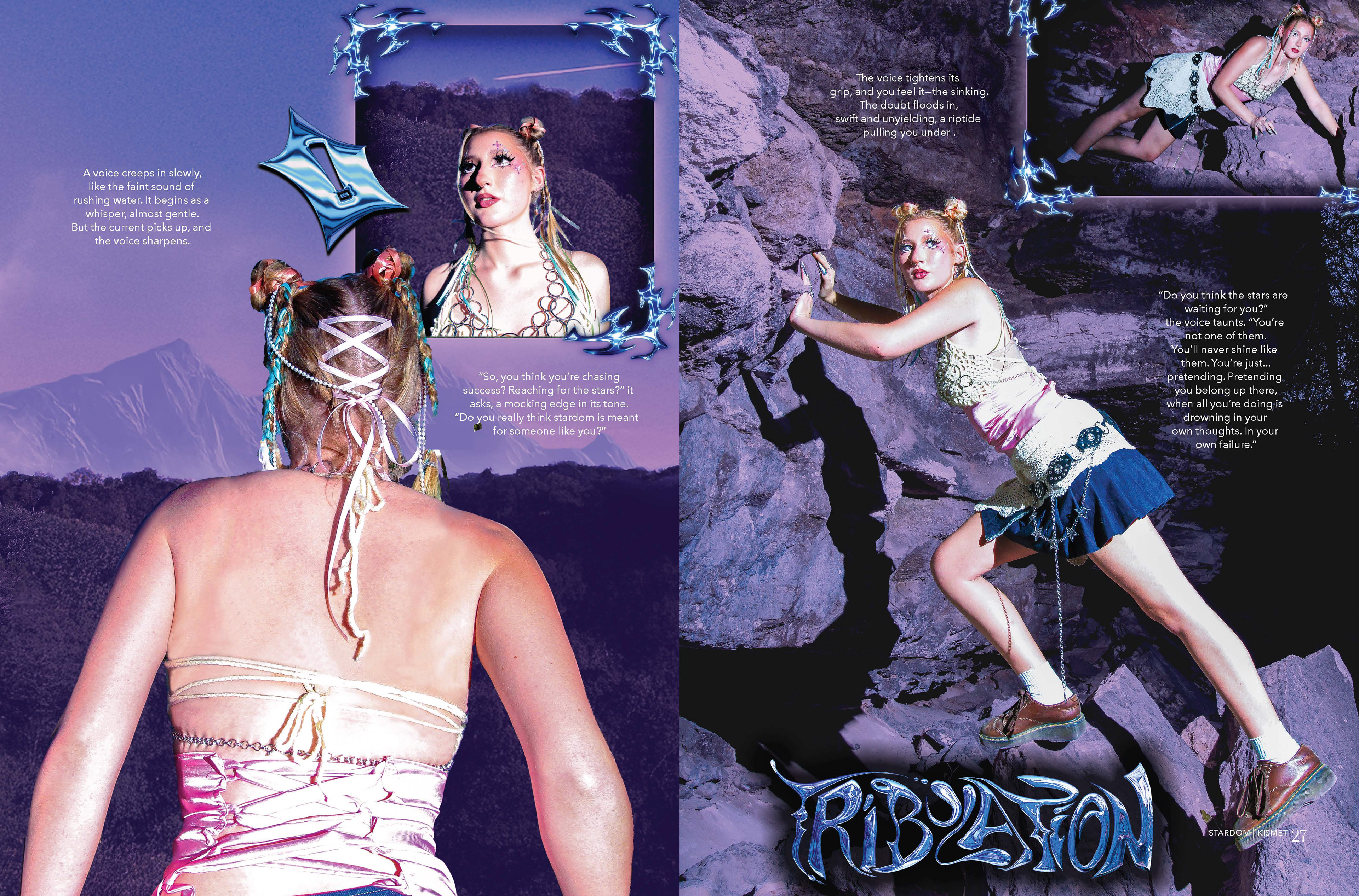
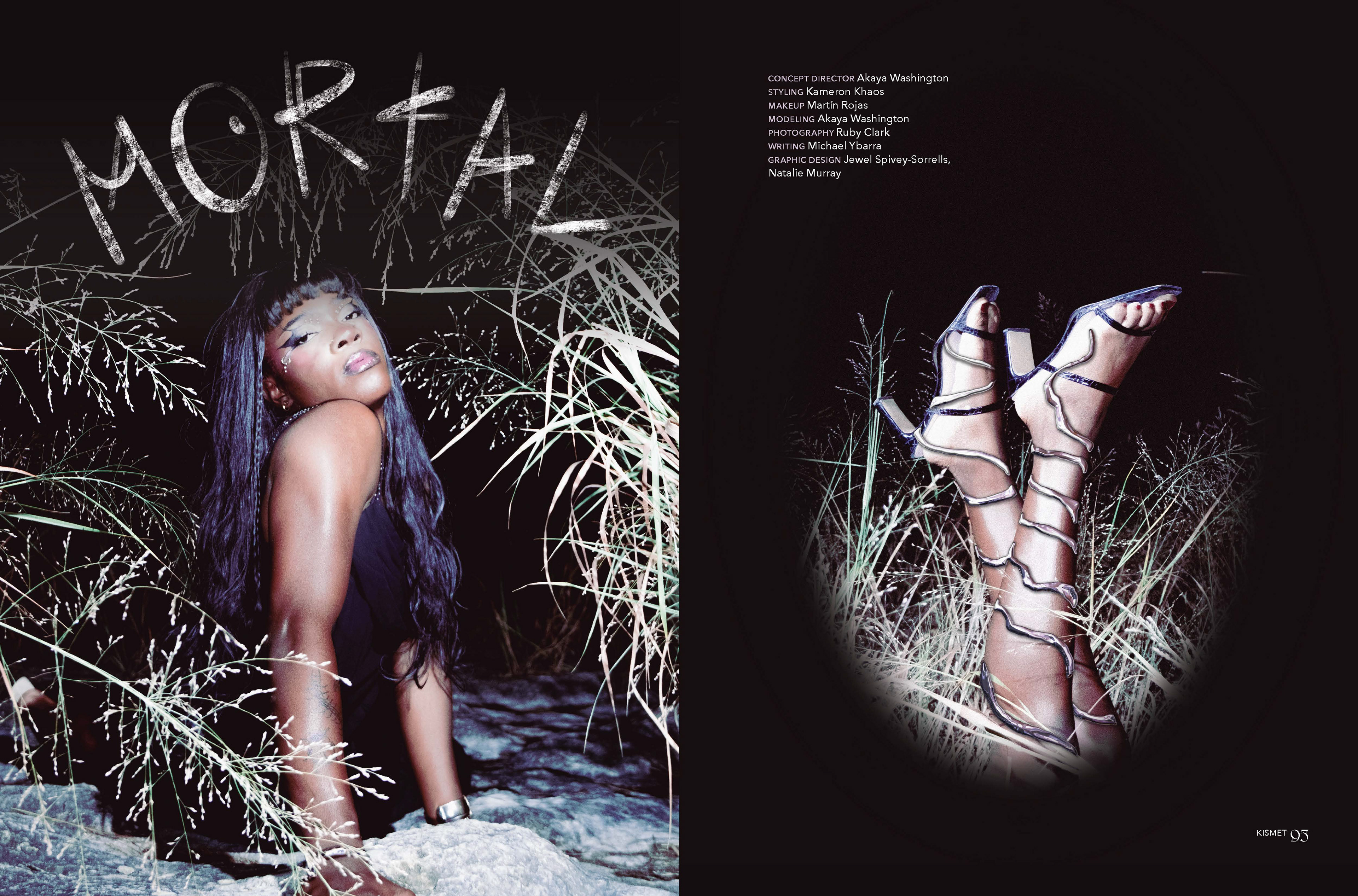
Additional display typefaces were chosen for each concept. These included: Galber Regular, Almanach Light Italic, Seasoned Hostess Regular, Courier New Regular, Cinzel Decorative Bold, La Bohemienne Regular, Marvin Regular, Sporty Pro Regular Inline, ITC Franklin Gothic Std Demi Compressed Italic, R41 Gotico Regular, Fleur Bold, Receipt Regular Narrow, and Ballet Regular. Martín Rojas and Natalie Murray also contributed hand-illustrated typography for "Stardom" and "Mortal," respectively.
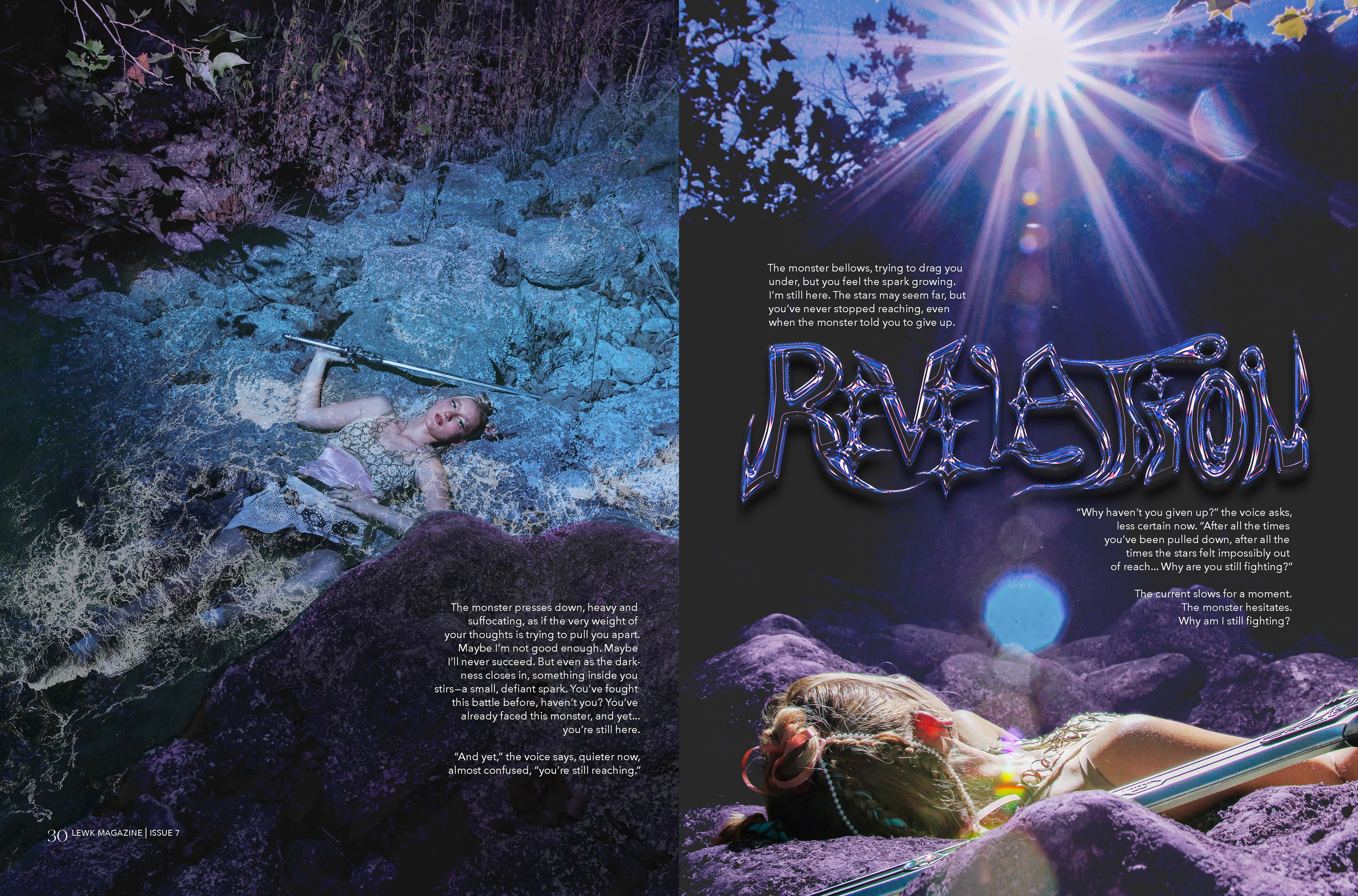
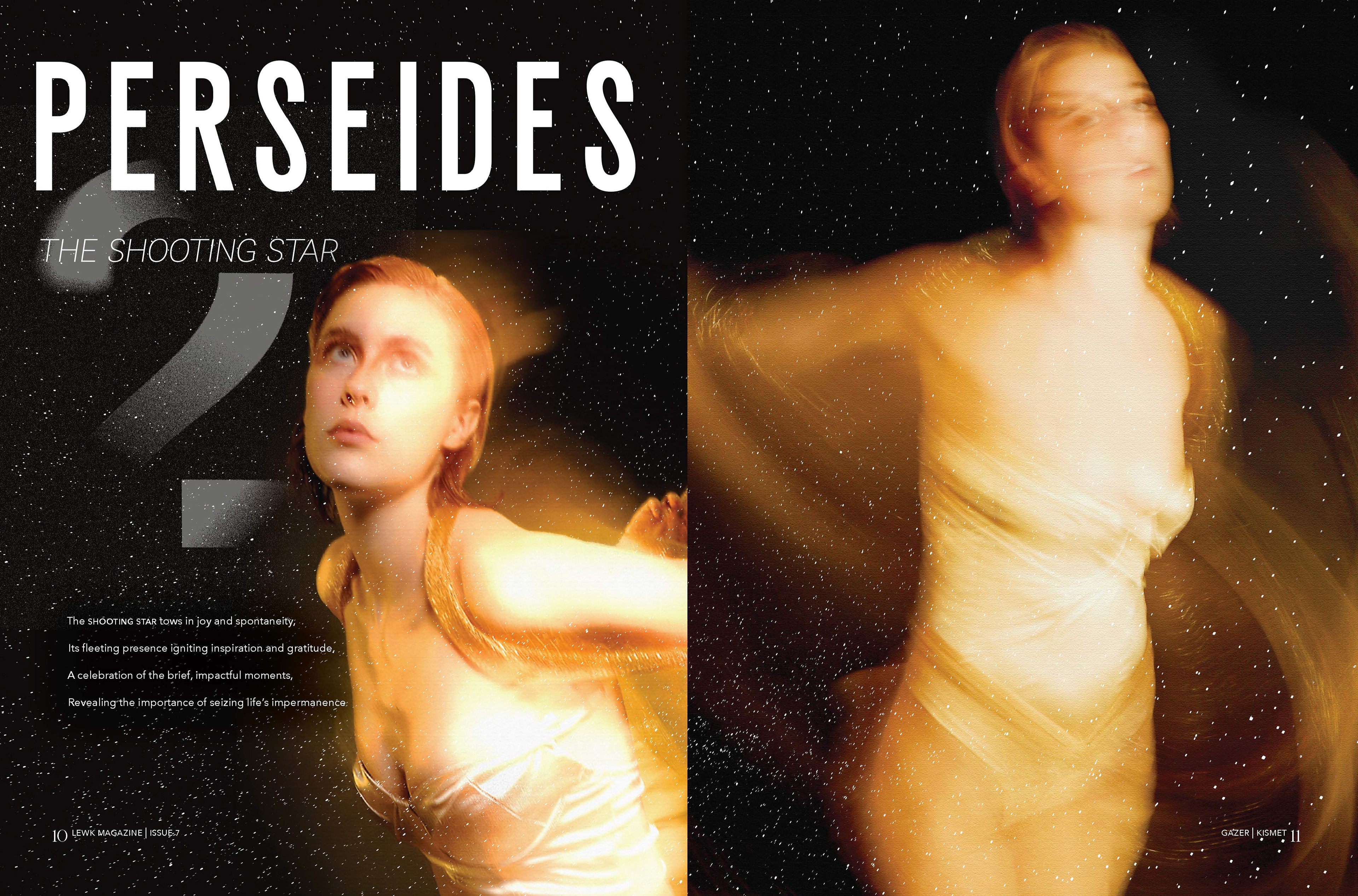
Kismet: Stardom 1
Kismet: Stardom 1
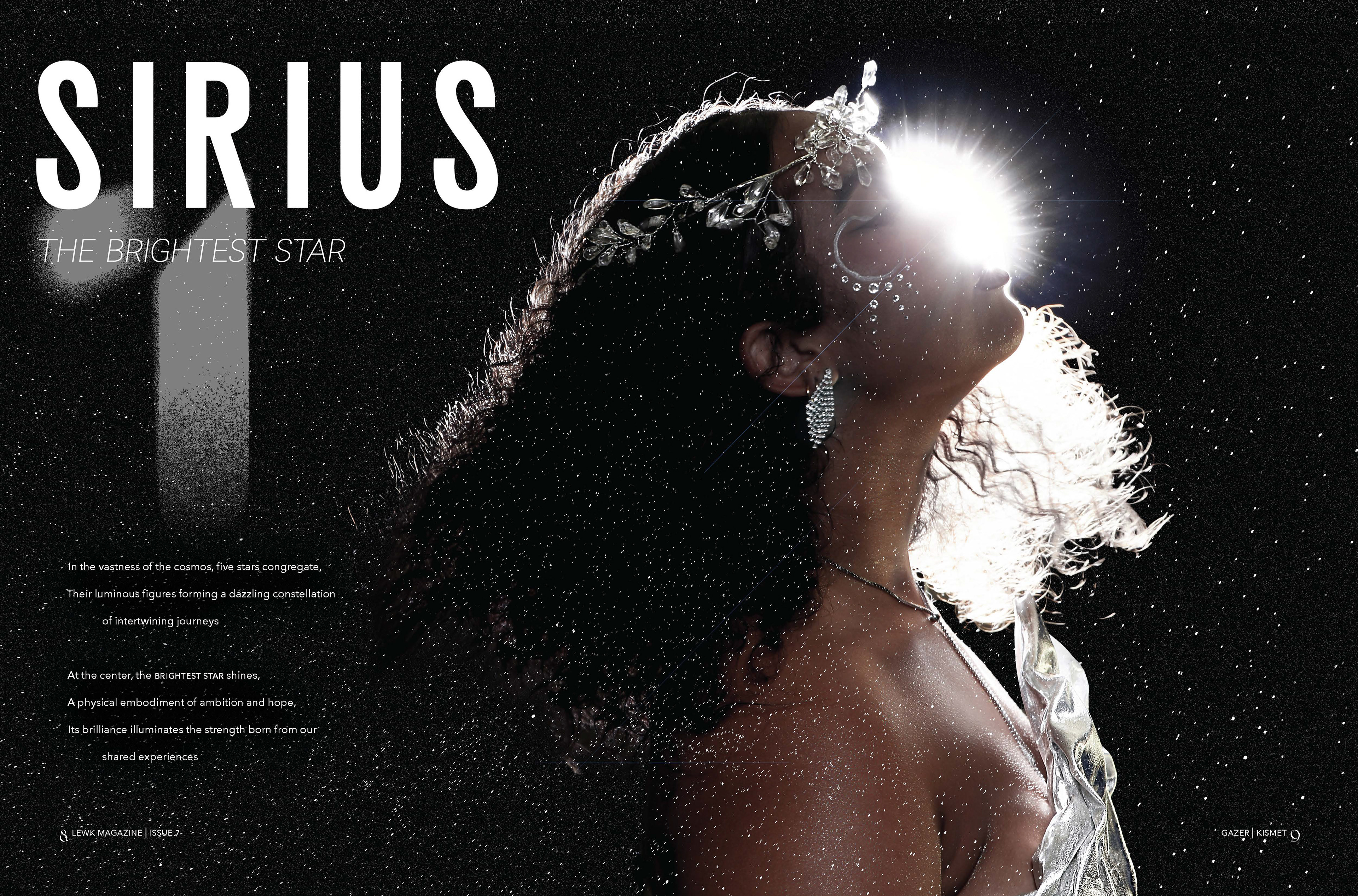
Kismet: Stardom 2
Kismet: Stardom 2
Kismet: Mortal 1
Kismet: Mortal 1
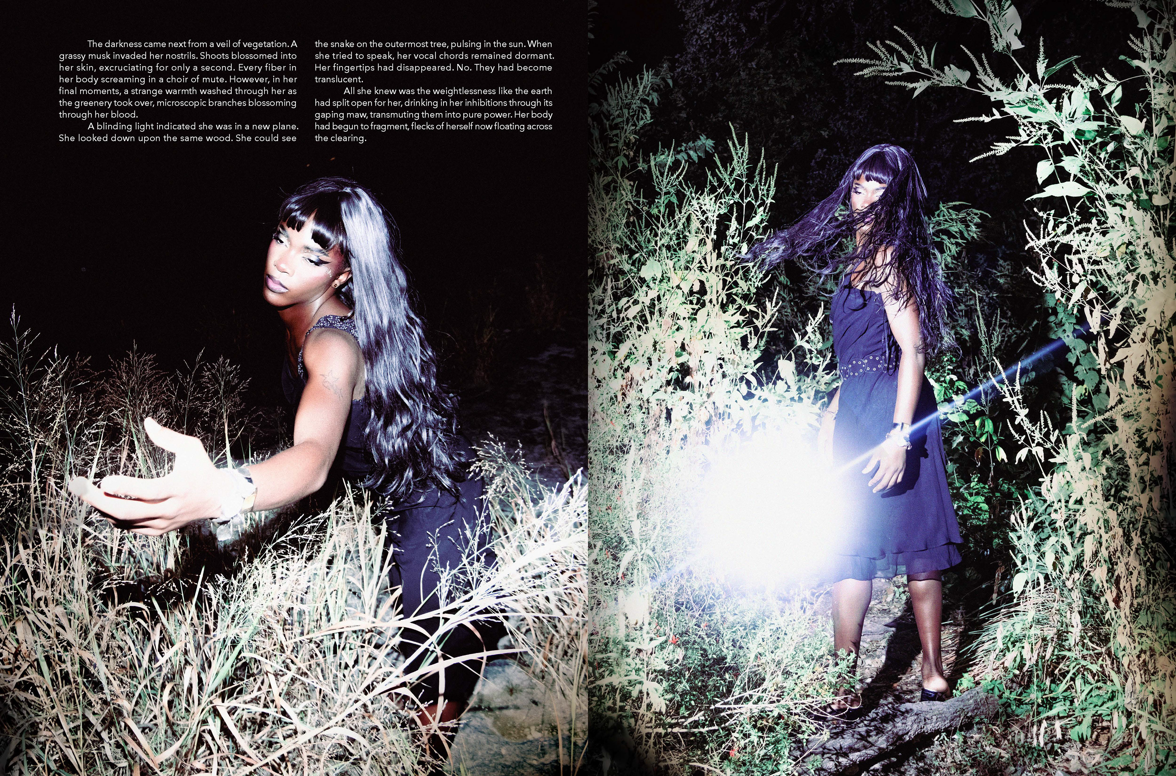
Kismet: Mortal 2
Kismet: Mortal 2
Kismet: Mortal 3
Kismet: Mortal 3
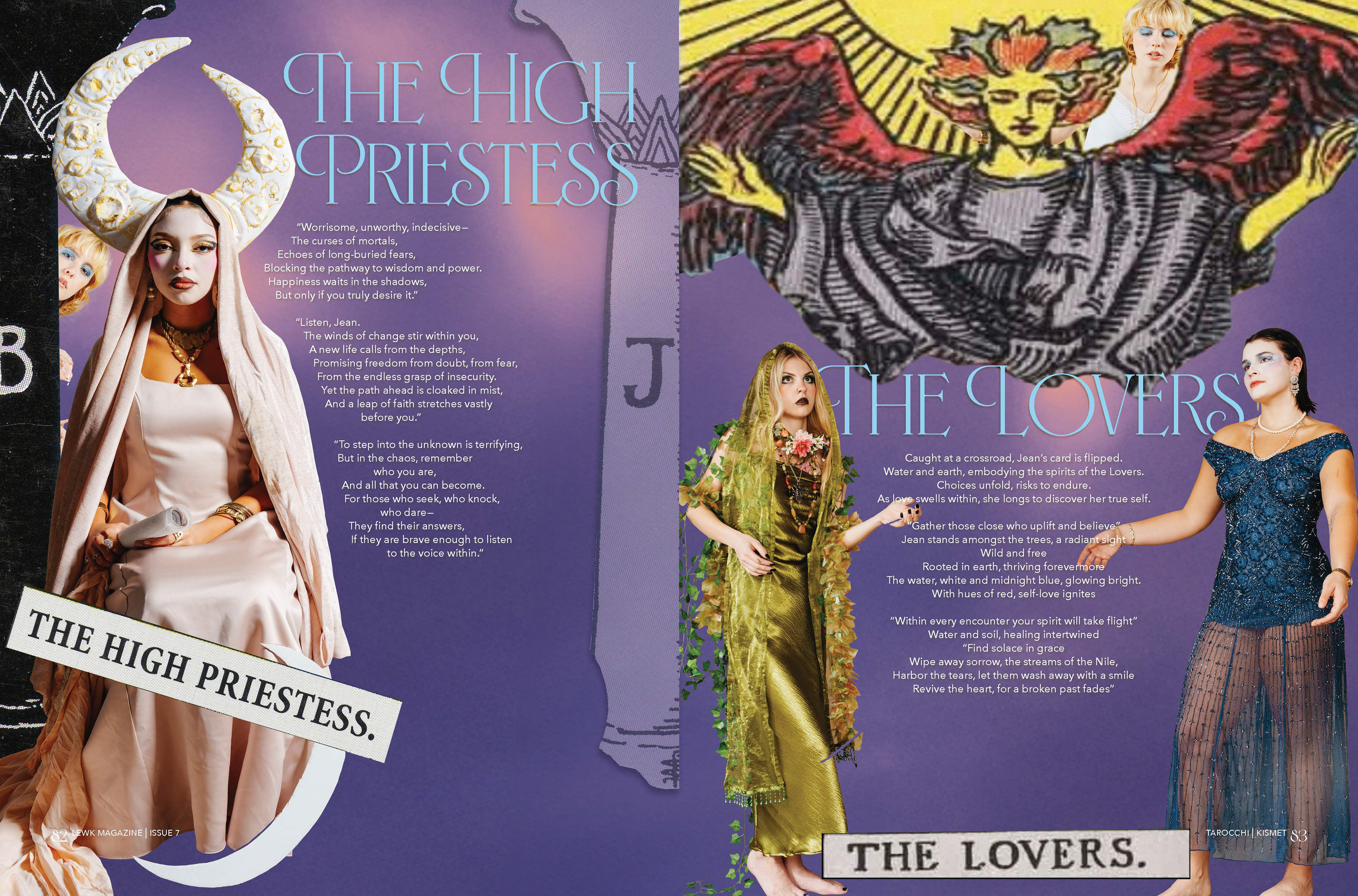
Kismet: Tarocchi 1
Kismet: Tarocchi 1
Kismet: Tarocchi 2
Kismet: Tarocchi 2
Kismet: Gazer 1
Kismet: Gazer 1
Kismet: Gazer 2
Kismet: Gazer 2
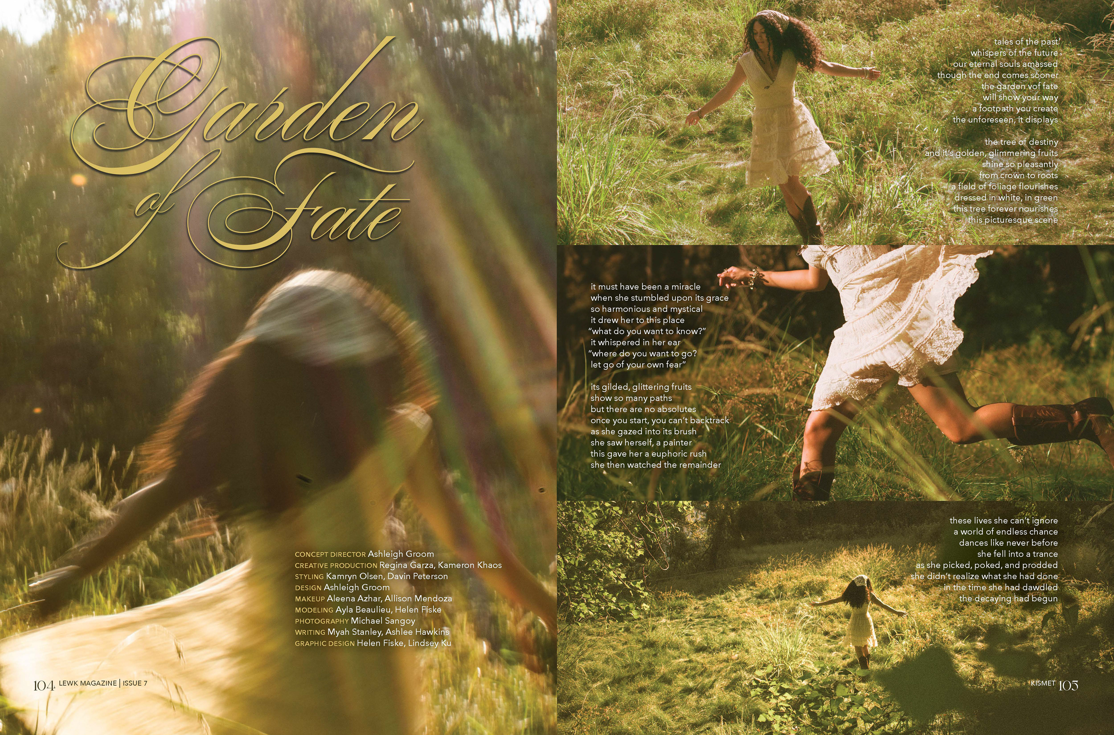
Kismet: Garden of Fate 1
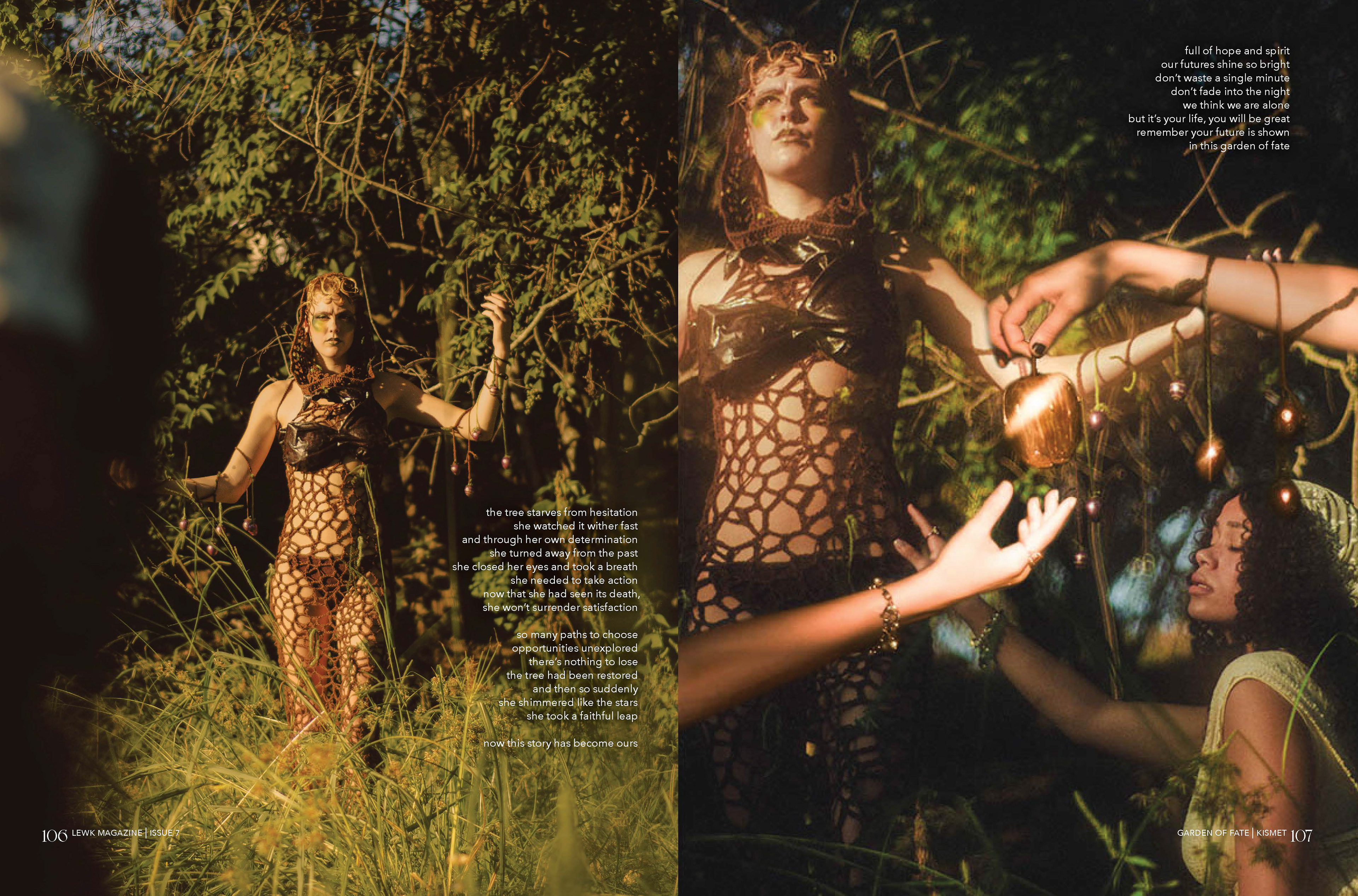
Kismet: Garden of Fate 2
Graphic designers were provided initial paragraph styles to further unify the typesetting. Styles for poetry and ragged/justified prose were used. However, designers retained some creative freedom in their typographic choices where appropriate. For example, the graphic designers for "Gazer" use 24pt leading rather than the established 12pt to symbolize the vastness of the cosmos. Additional guidance was provided at the end of the design process to adjust any distracting rags. 
Concept Management
As Lewk leadership, one of my roles this issue was the conception and execution of one of our visual concepts. This involved coordinating between several departments, such as styling, hair/makeup, and photography, as well as overseeing the photoshoot. 
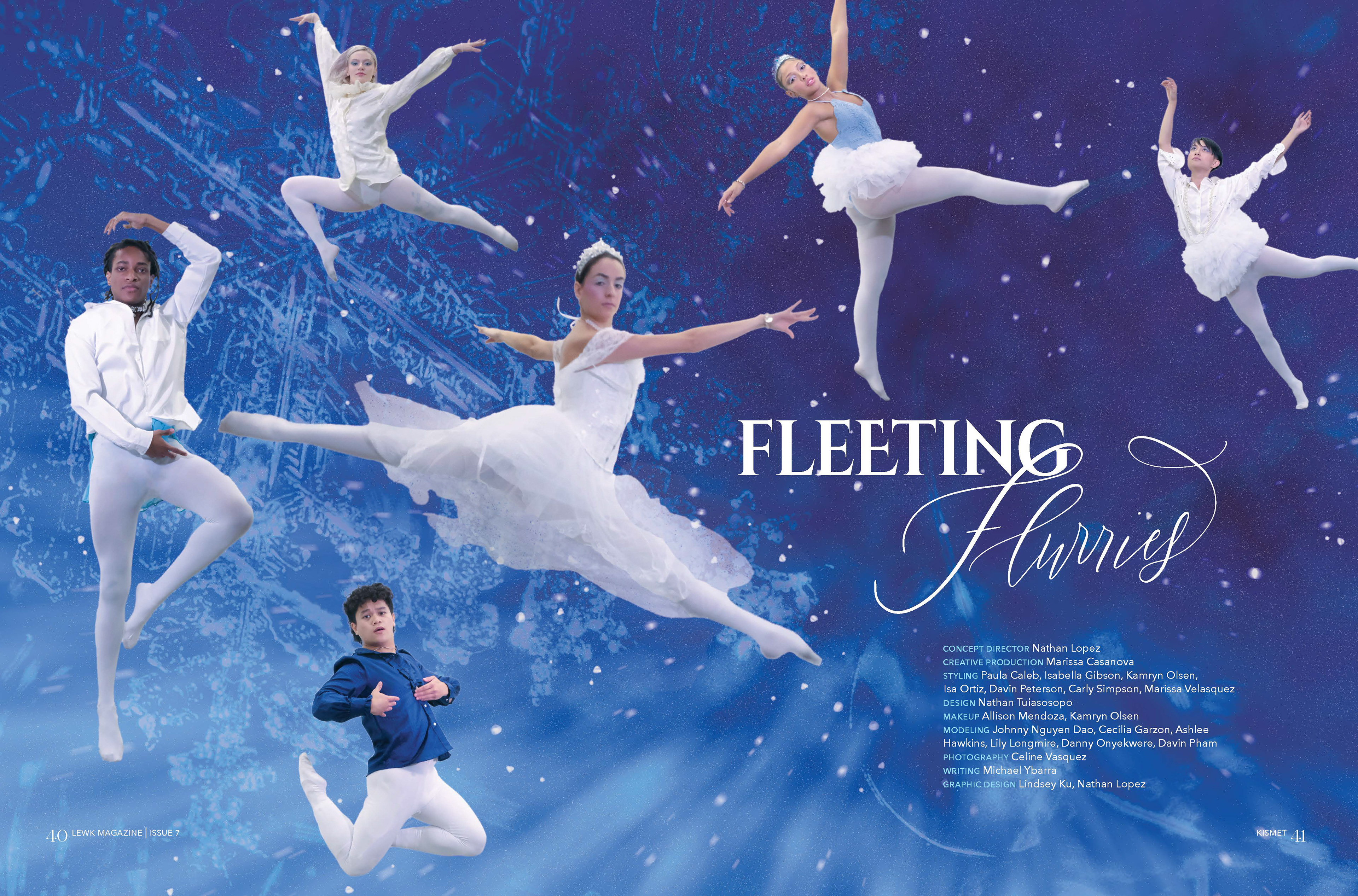
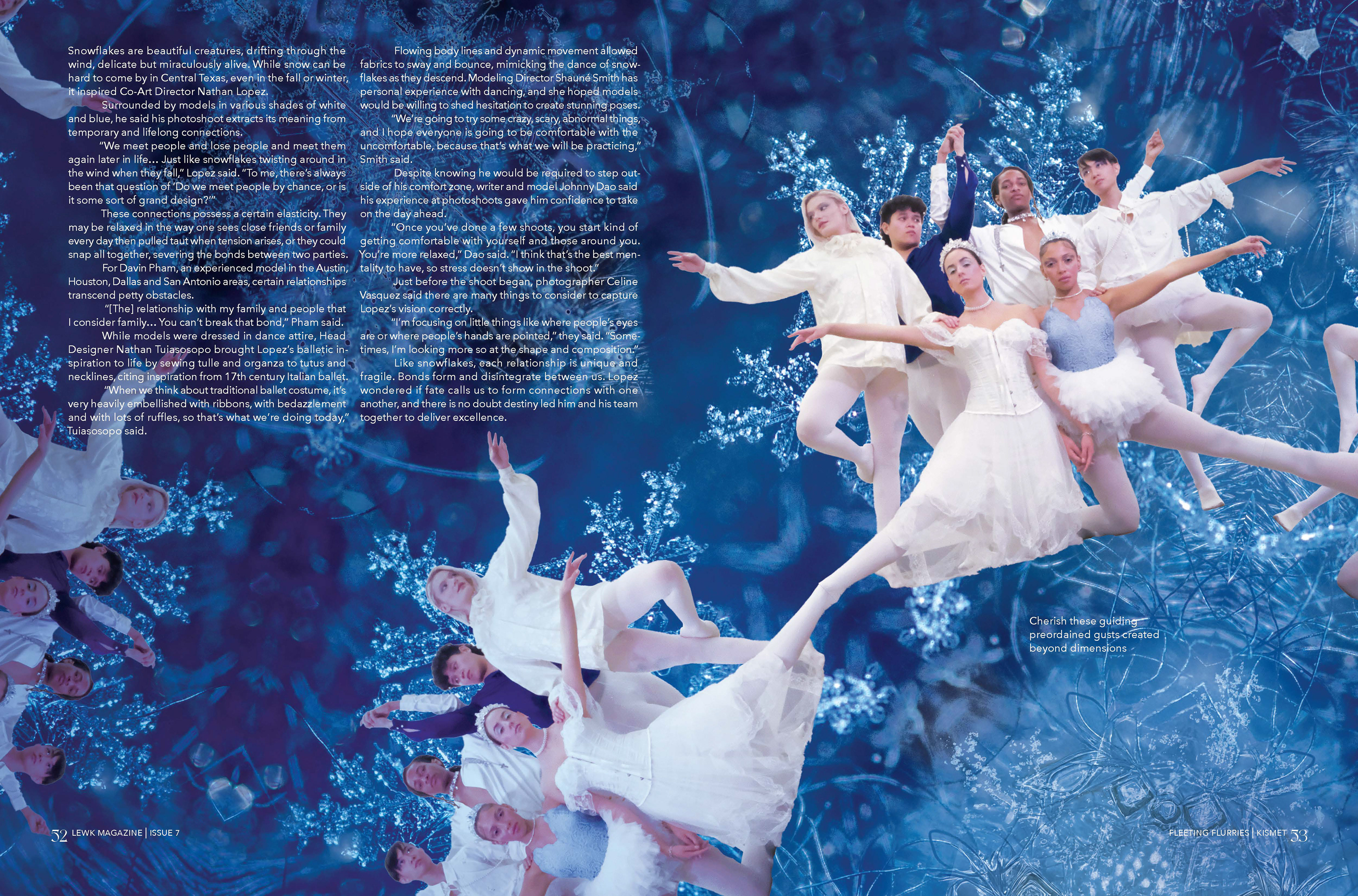
After brainstorming, I ultimately decided on my concept called "Fleeting Flurries." It centers around relationships and how people enter and leave our lives at seemingly random times. The concept uses snow and ballet motifs because, like people going through life, snowflakes and ballet dancers gracefully mingle and disperse repetitively over the course of their journeys, whether it's through the sky or across the stage. 
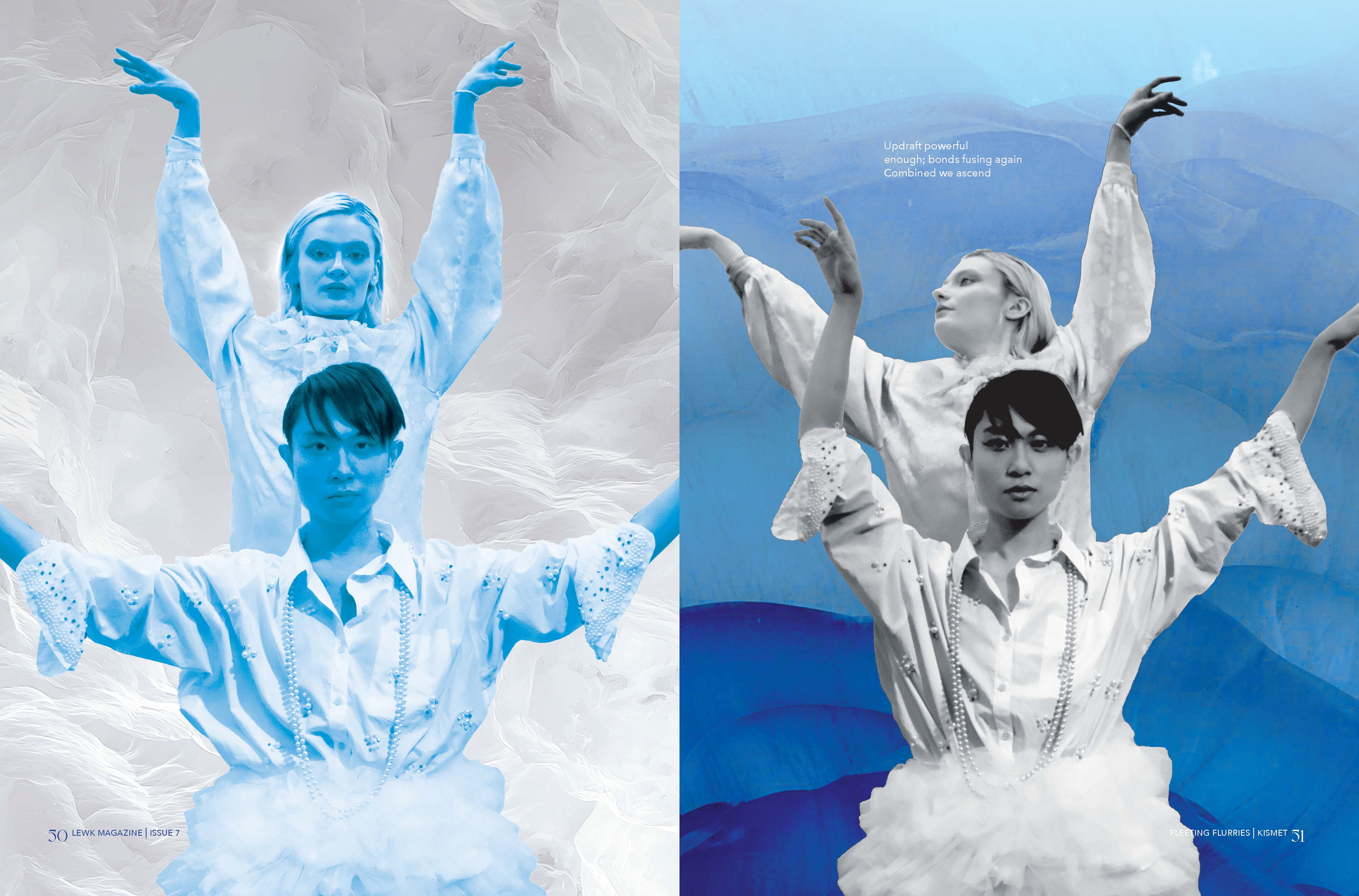
With this underlying theme in mind, I wanted to create a strong sense of pattern and repetition. This would mimic that of individual snowflakes' fractal shapes as well as the natural patterns one would see large clusters of countless snowflakes. Therefore, visual inspiration was found in Geoff Lowe's 2024 Olympics photography. By combining a series of athletes' photos, he creates rhythm and movement through an allover composition. Outside of Lowe's work, the use of kaleidoscopic patterns create a similar sense of repetition and were also used in the visuals for this concept.
Kismet: Fleeting Flurries 1
Kismet: Fleeting Flurries 2
Kismet: Fleeting Flurries 3

You may also like

Back to Top