From critiquing beauty standards to exploring the relationship between creation and creator, Synthetic examines the human experience as artificial rather than something natural. Initially inspired by The Beatles and Sgt. Pepper's Lonely Hearts Club Band, the issue largely focuses on bright, oversaturated visuals. My position as Art Director allowed me to help the designers across concepts as well as structure the underlying framework for the entire issue including the body typesetting, margins, grid system, and folios.
Concept Management
I was given another opportunity to lead one of our photoshoots, from conceptualization to shoot day to the final layouts. "Diet Culture" centers around our relationship with food, our bodies, and media. Often, social media and advertisements can negatively affect people's self-image and lead to issues such as eating disorders, anabolic steroid use, and other substance abuse. This concept aims to demonstrate the absurdity of these types of products and marketing tactics. Layouts are inspired by ads one would commonly find in a fashion magazine, but rather than real sponsors, these ads featured satirical beverages with original branding and packaging mockups.
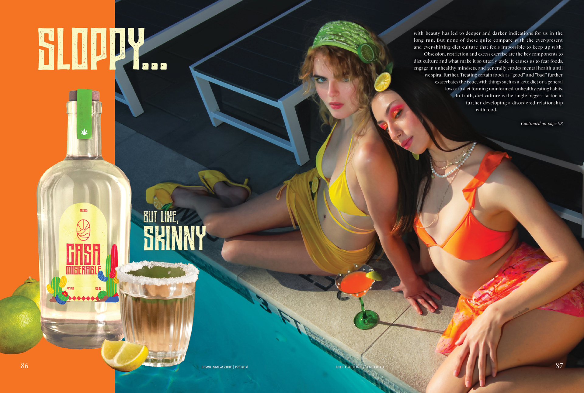
Diet Culture: Casamiserable
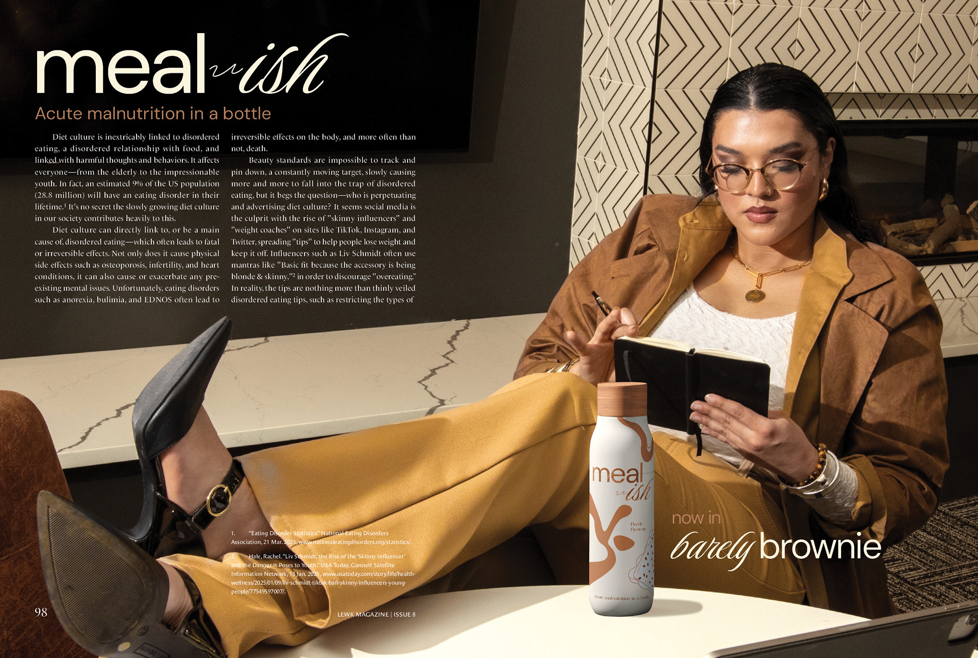
Diet Culture: Meal-ish
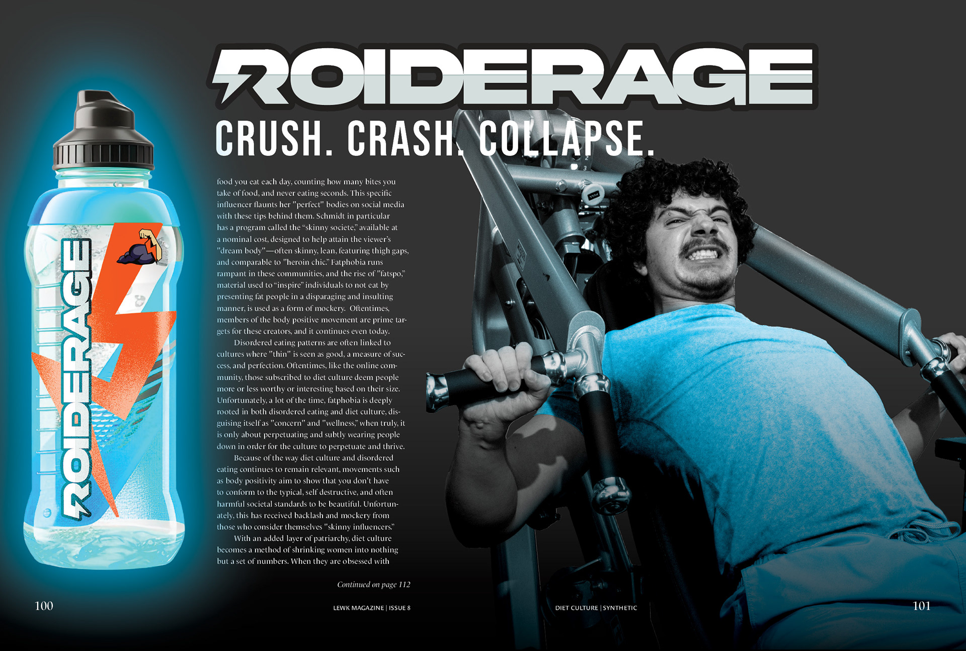
Diet Culture: Roiderage
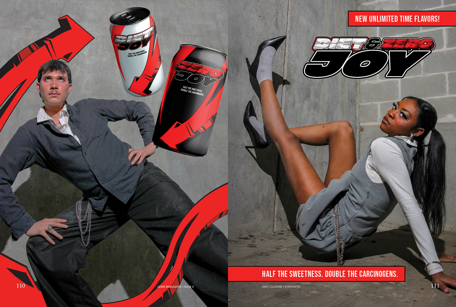
Diet Culture: Diet/Zero Joy
Photo Editing and Layout Design
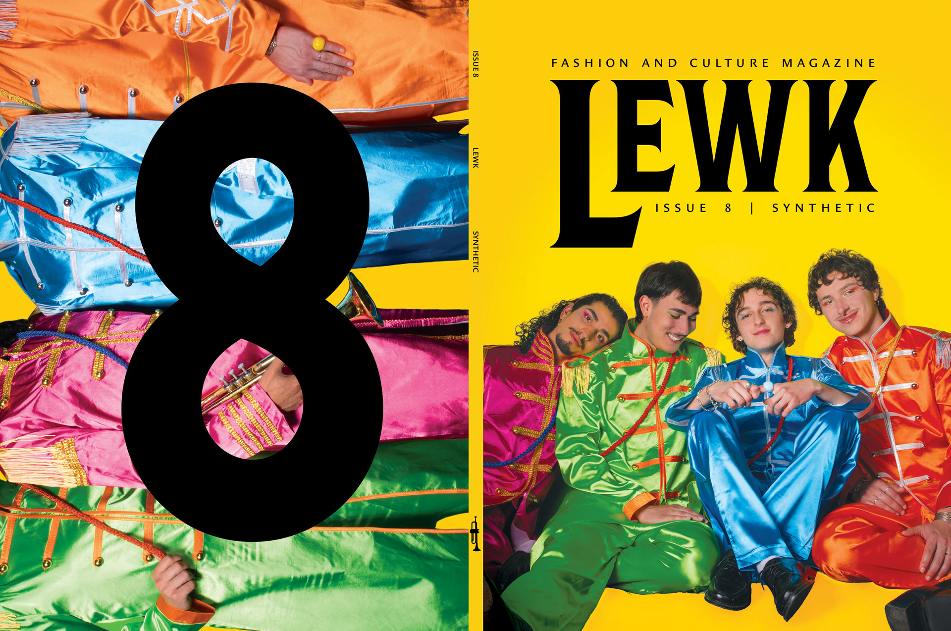
The visual concept "The Beatles" was led by the Editor-in-Chief and used for the cover and end matter. It focuses on time as a construct and the genuine connection and nostalgia we feel about a past we did not personally experience. This utilized a lot of bright, contrasting colors and custom type treatments. The typeface Shackleton Condensed was selected for its heavy weight, sharp serifs, and low-contrast letterforms. The type was then manipulated to mimic The Beatles' logo with exaggerated descenders.
The Beatles: Contributors
The Beatles: Contents
The Beatles: Definition and Letter from the Editors
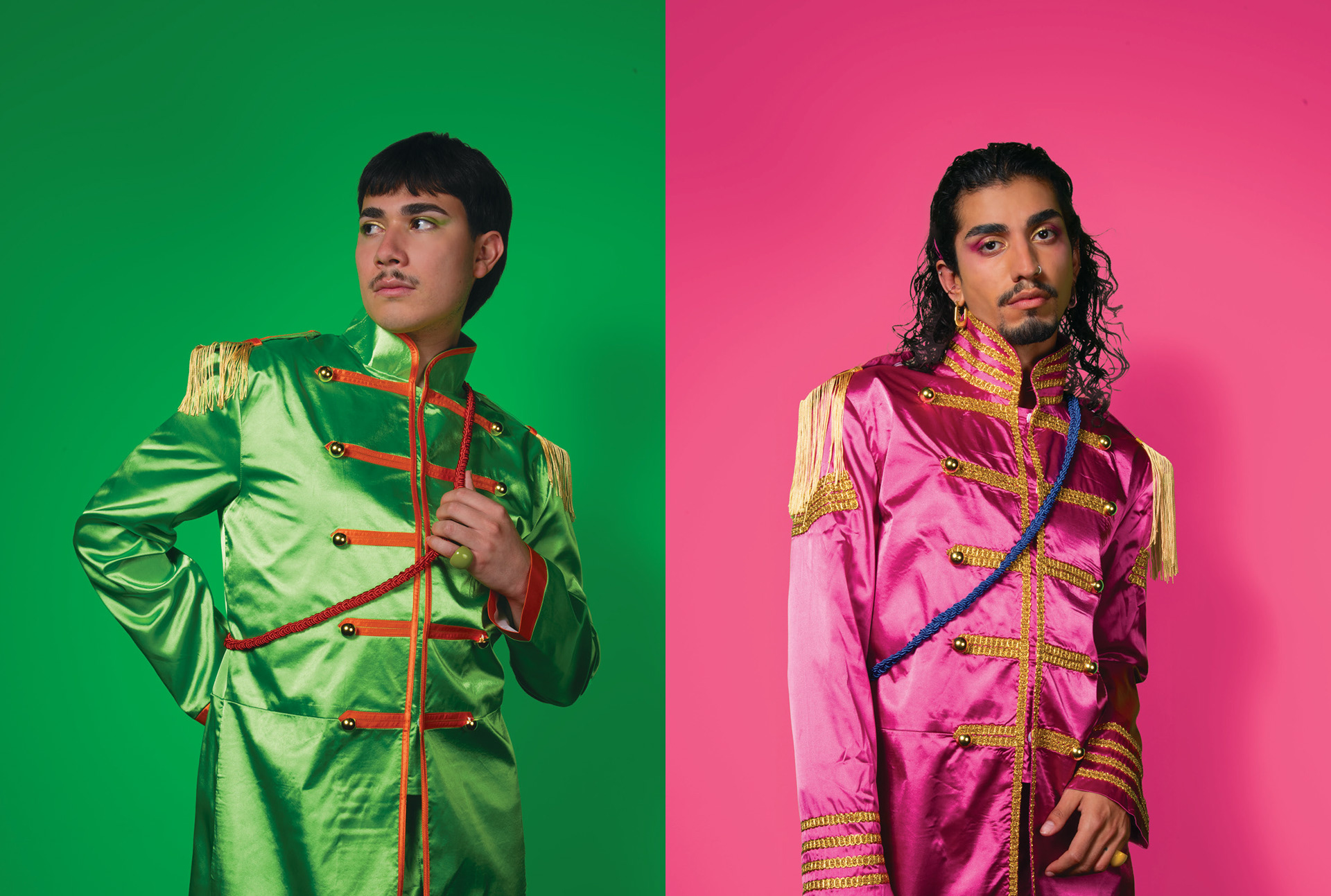
The Beatles: Green and Pink Solos
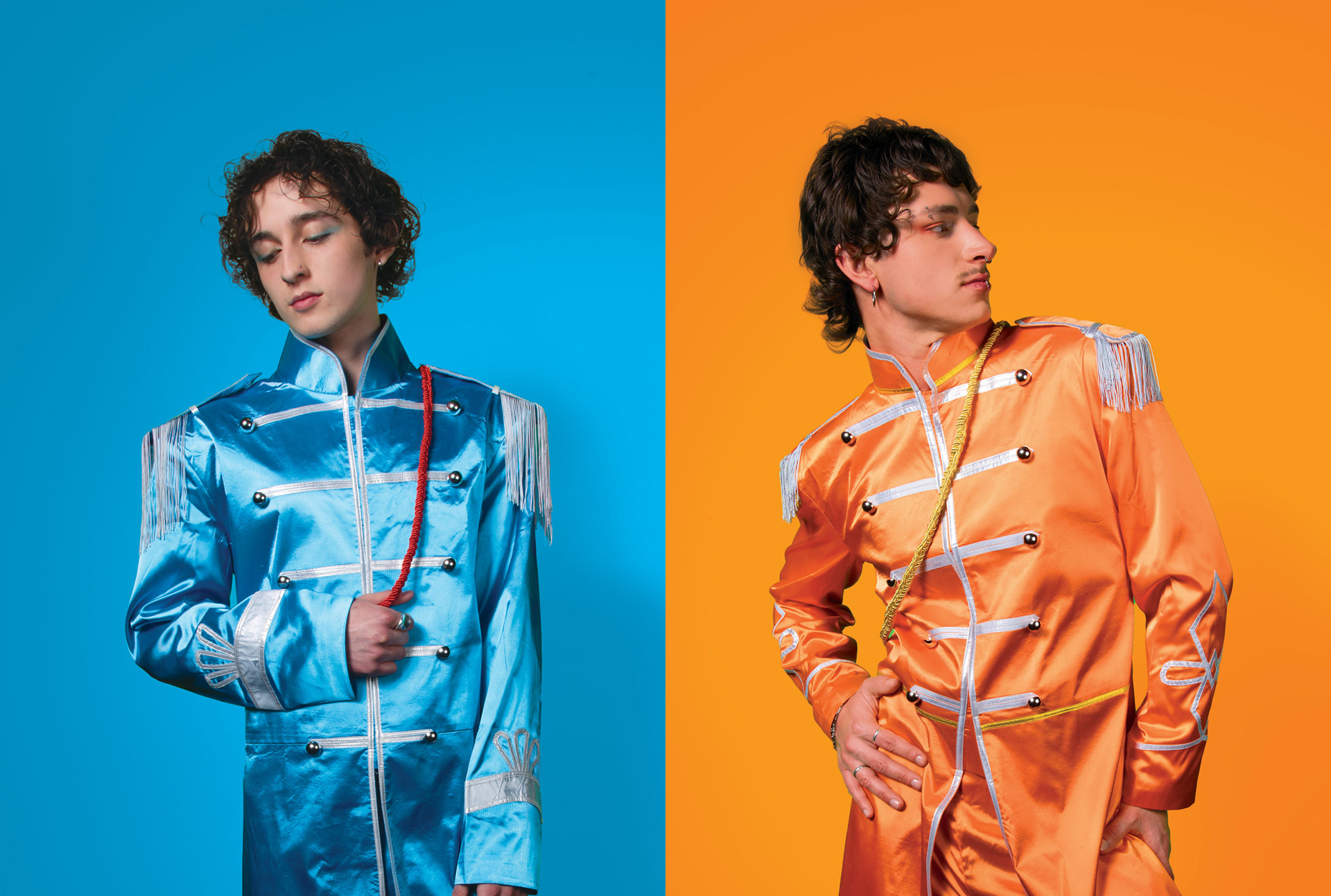
The Beatles: Blue and Orange Solos
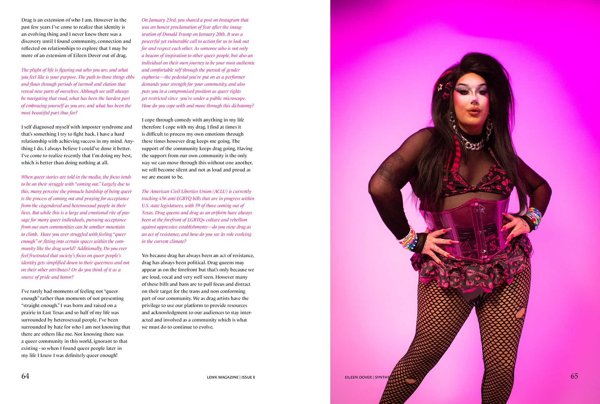
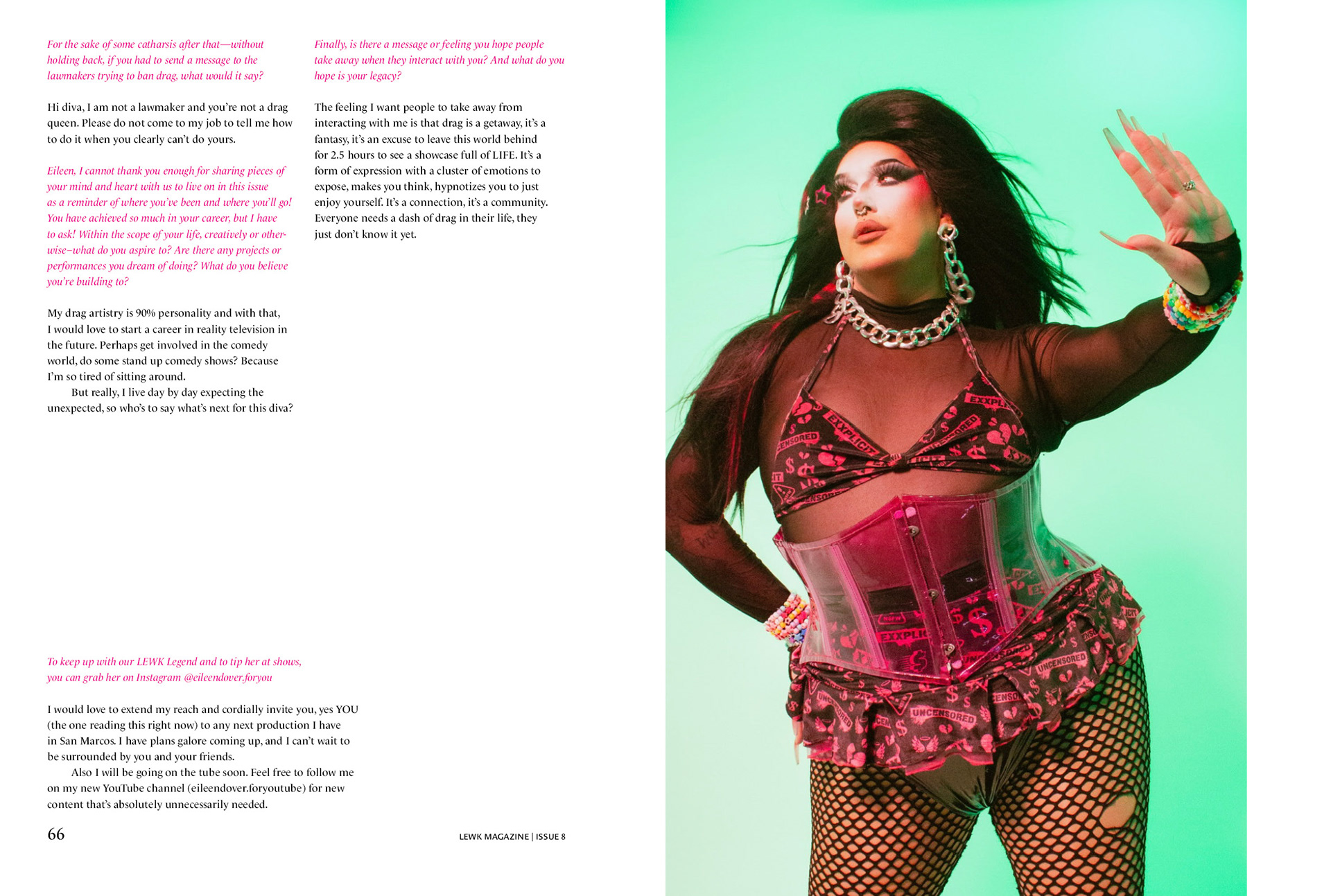
Center spreads were a community showcase focused on a local drag queen, LGBT rights advocate, and Lewk supporter, Eileen Dover. Because of the extensive interview with Dover, layouts were very type-heavy and required additional paragraph styles to ensure optimal readability and hierarchy.
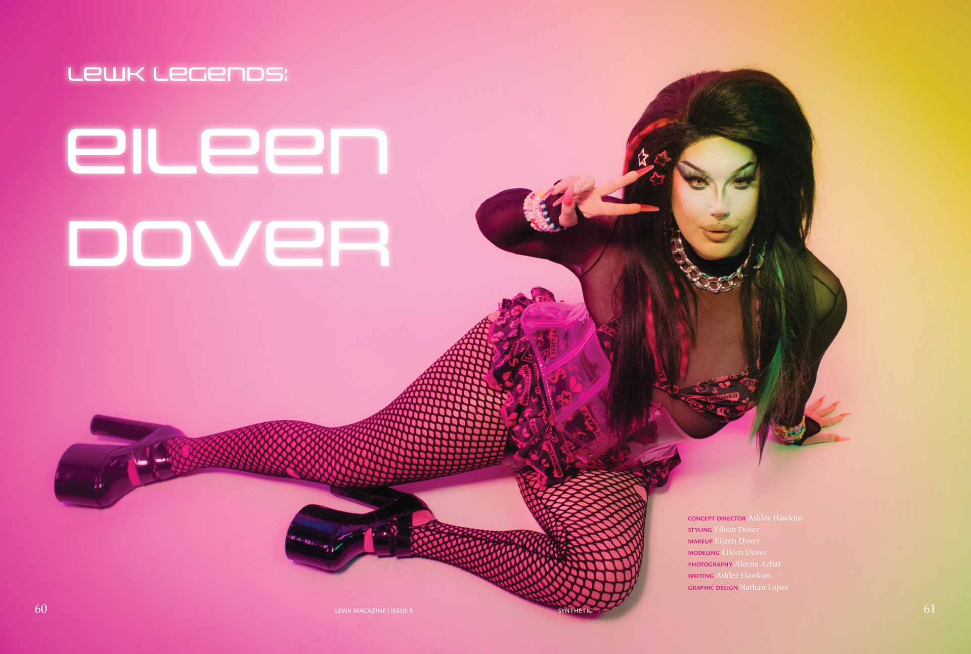
Eileen Dover: Title Spread
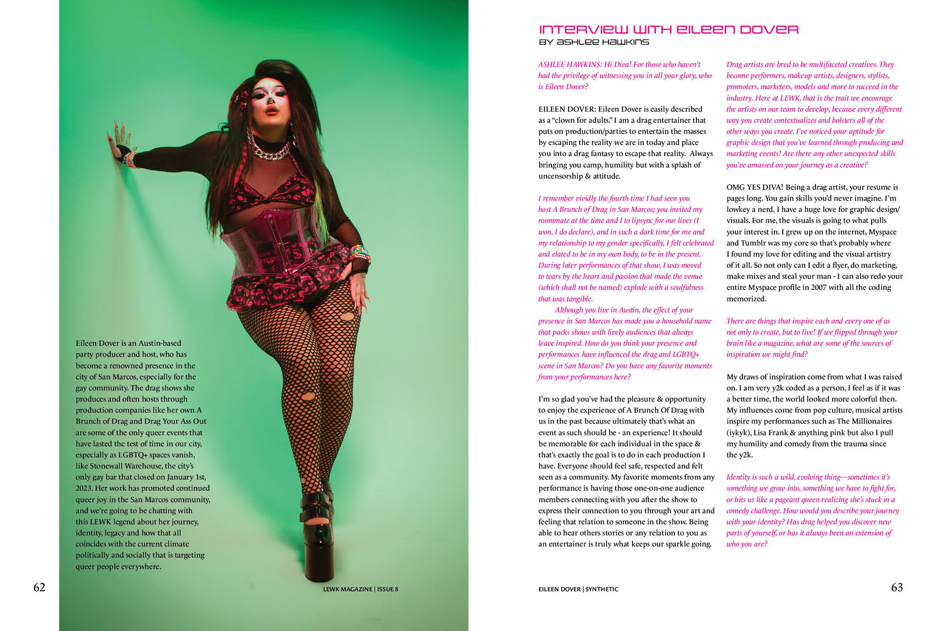
Eileen Dover: Interview 1
Eileen Dover: Interview 2
Eileen Dover: Interview 3
Art Direction
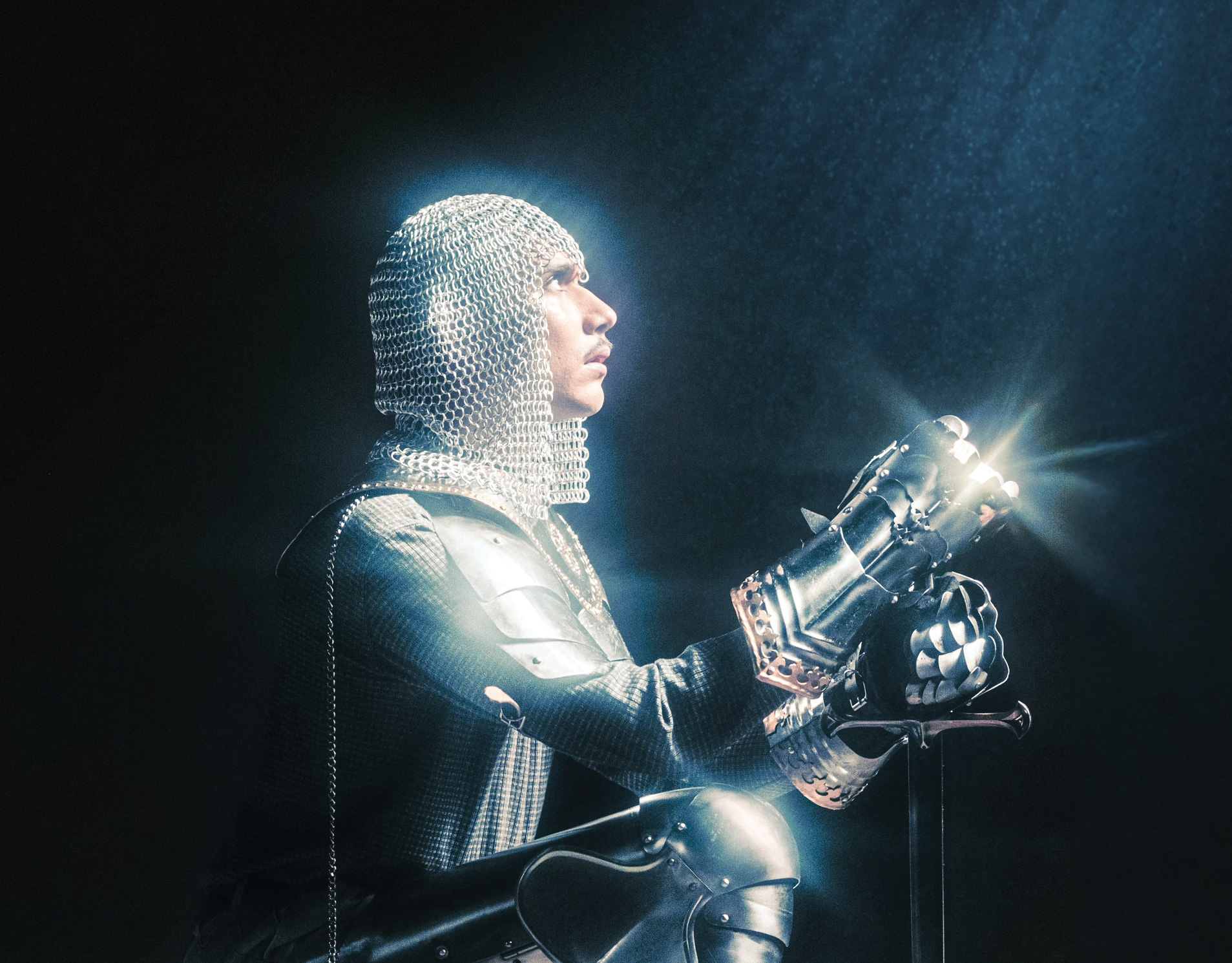
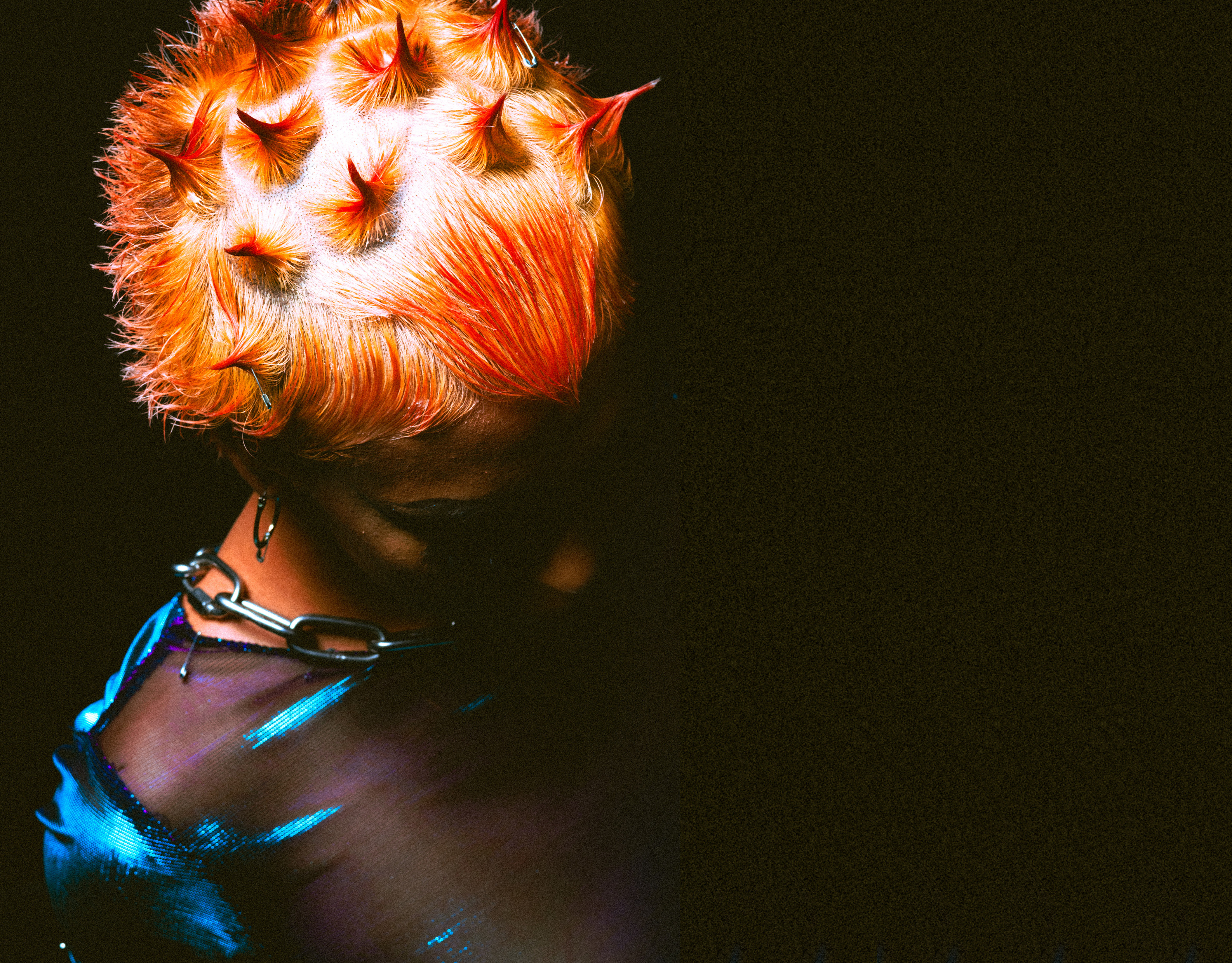
Additional support and direction was provided to the other graphic designers on our team. Image layouts, typefaces, and special effects were carefully curated to communicate each concept's unique message and visual style while still maintaining a cohesive structure throughout the magazine.
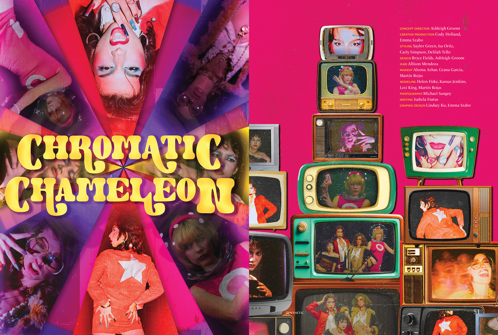
Chromatic Chameleon: Title Spread
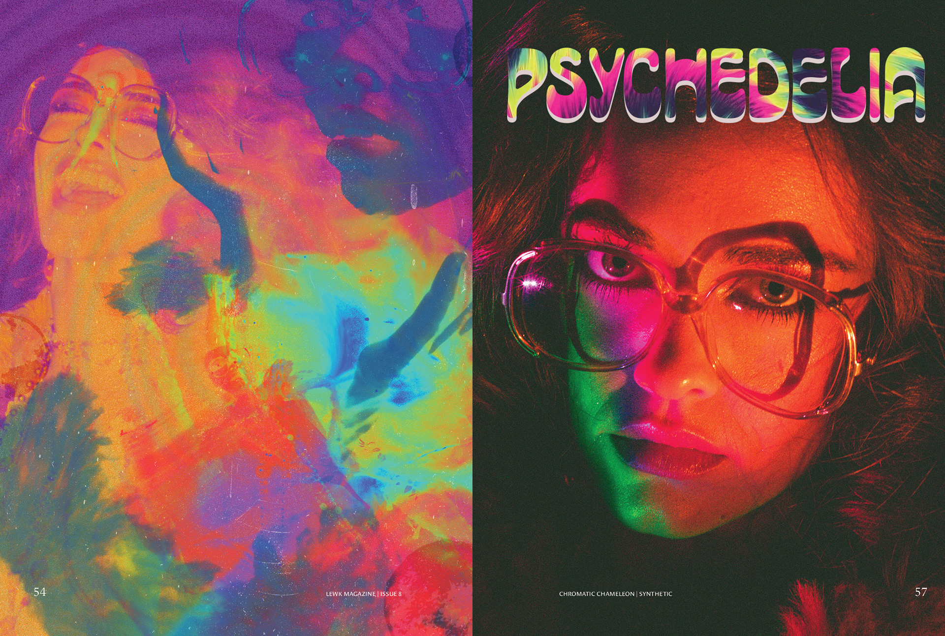
Chromatic Chameleon: Psychedelia
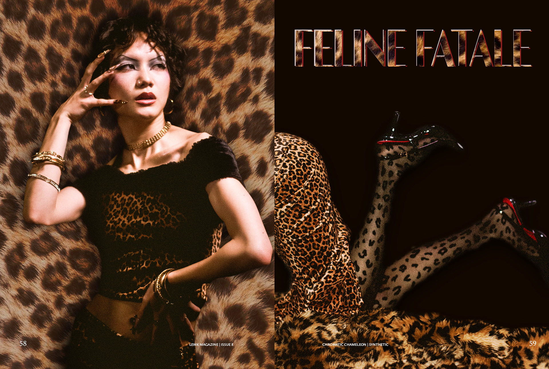
Chromatic Chameleon: Feline Fatale
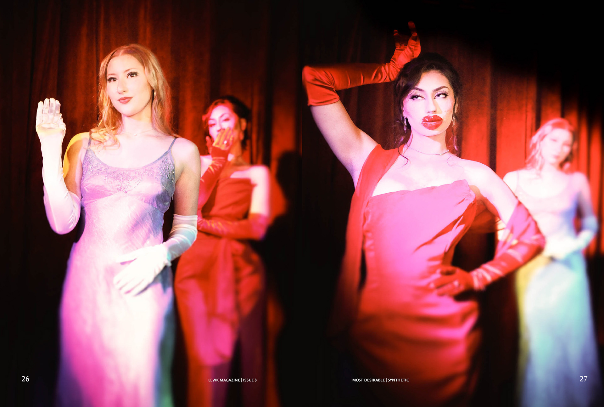
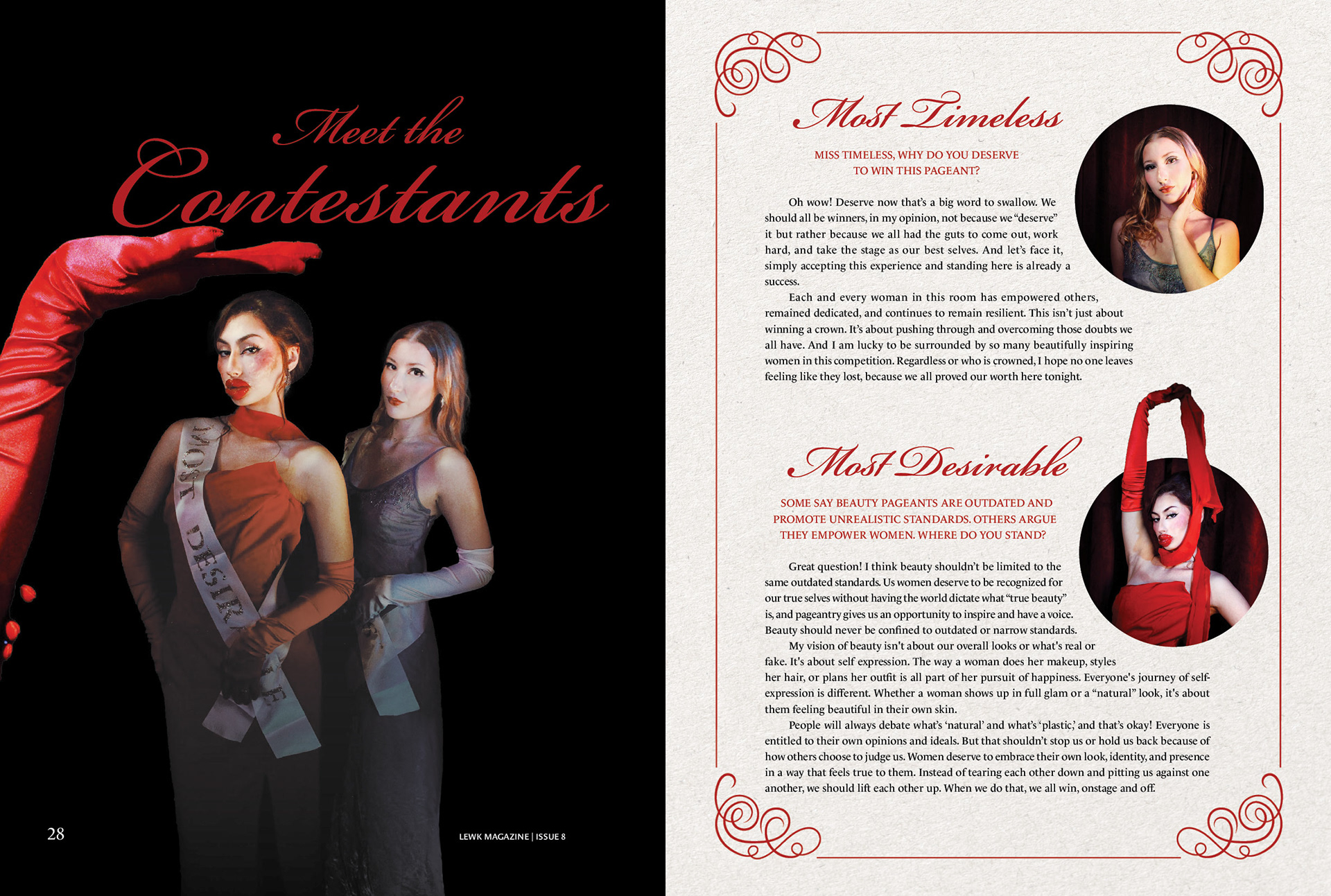
Most Desirable 1
Most Desirable 2
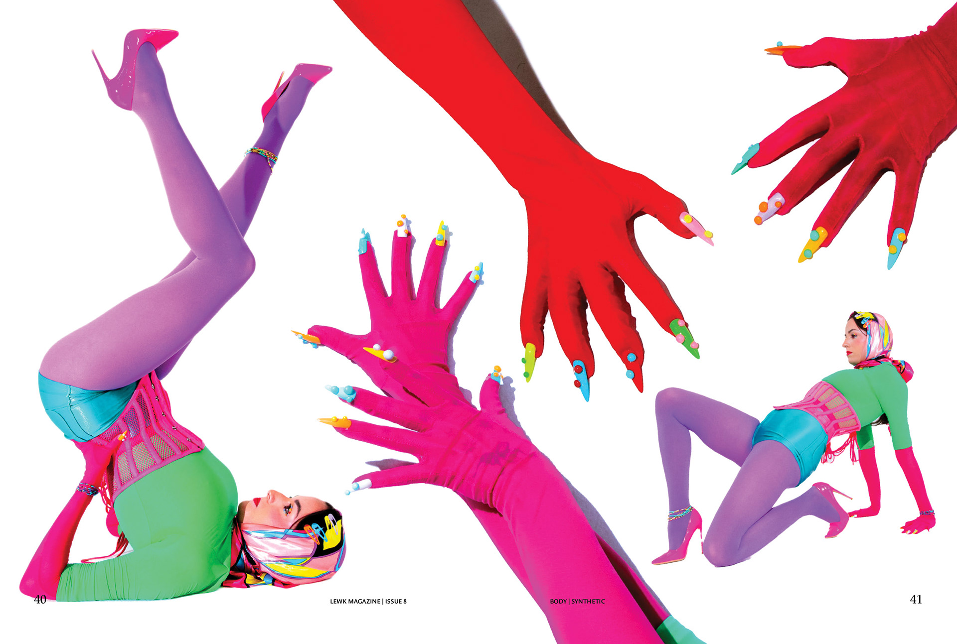
Body 1
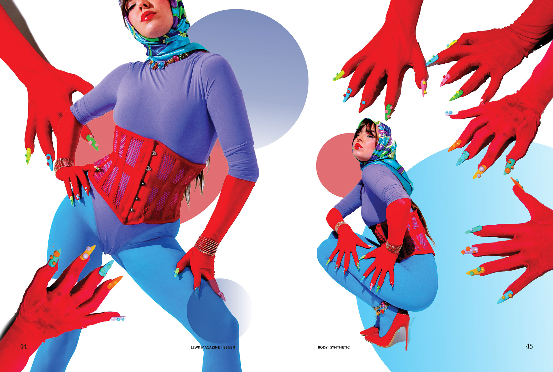
Body 2
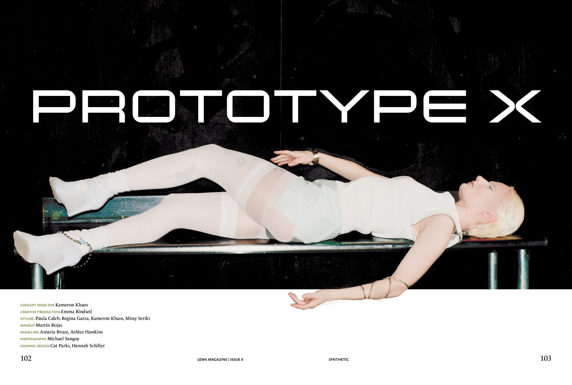
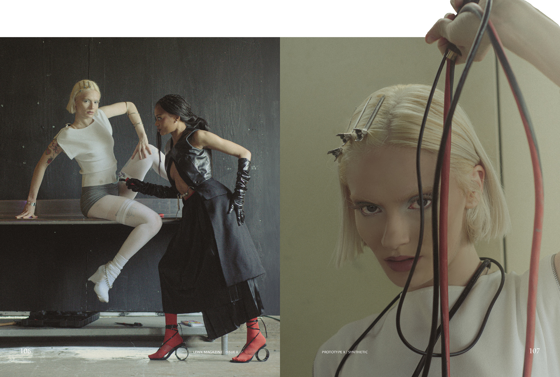
Prototype X: Title Spread
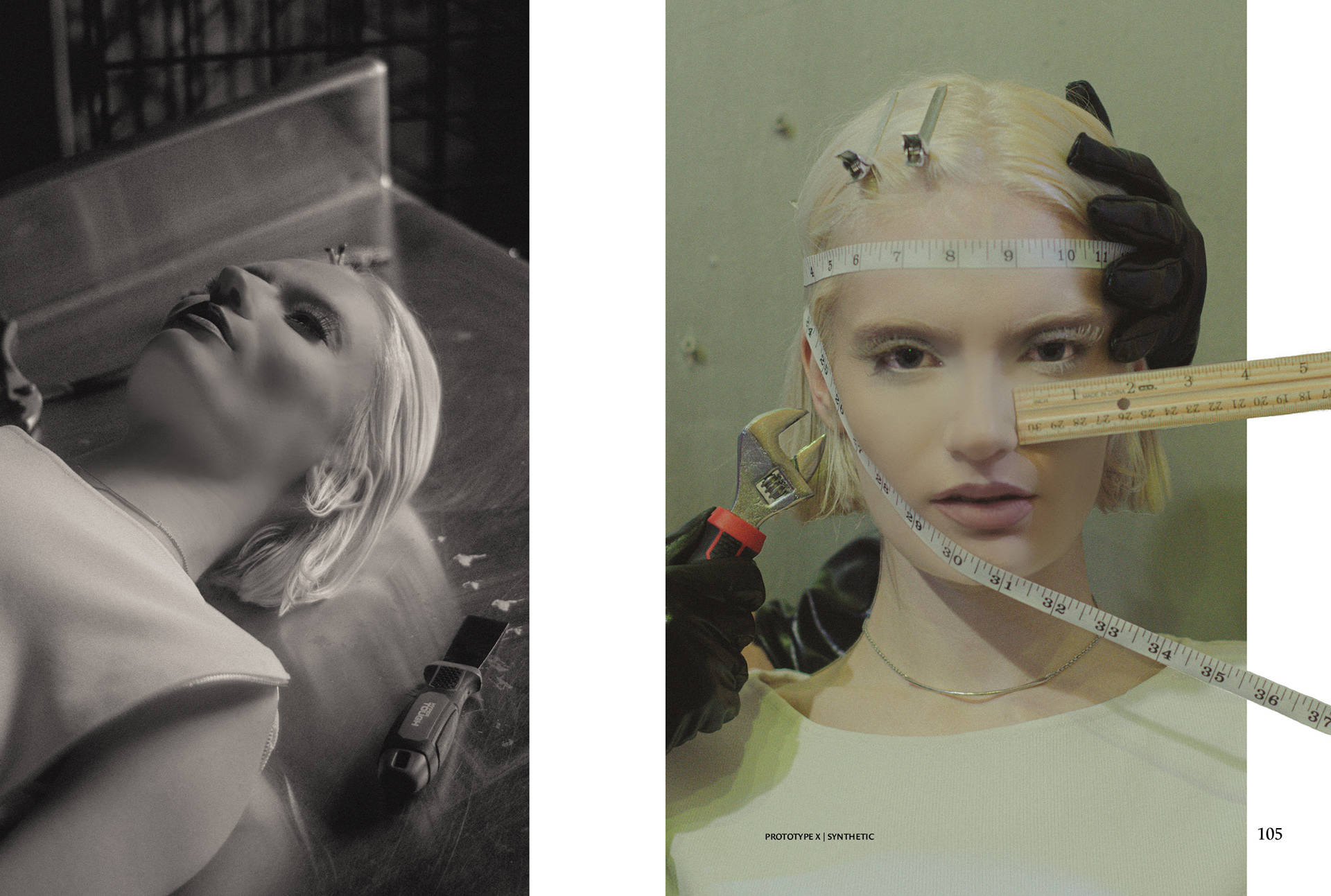
Prototype X 2